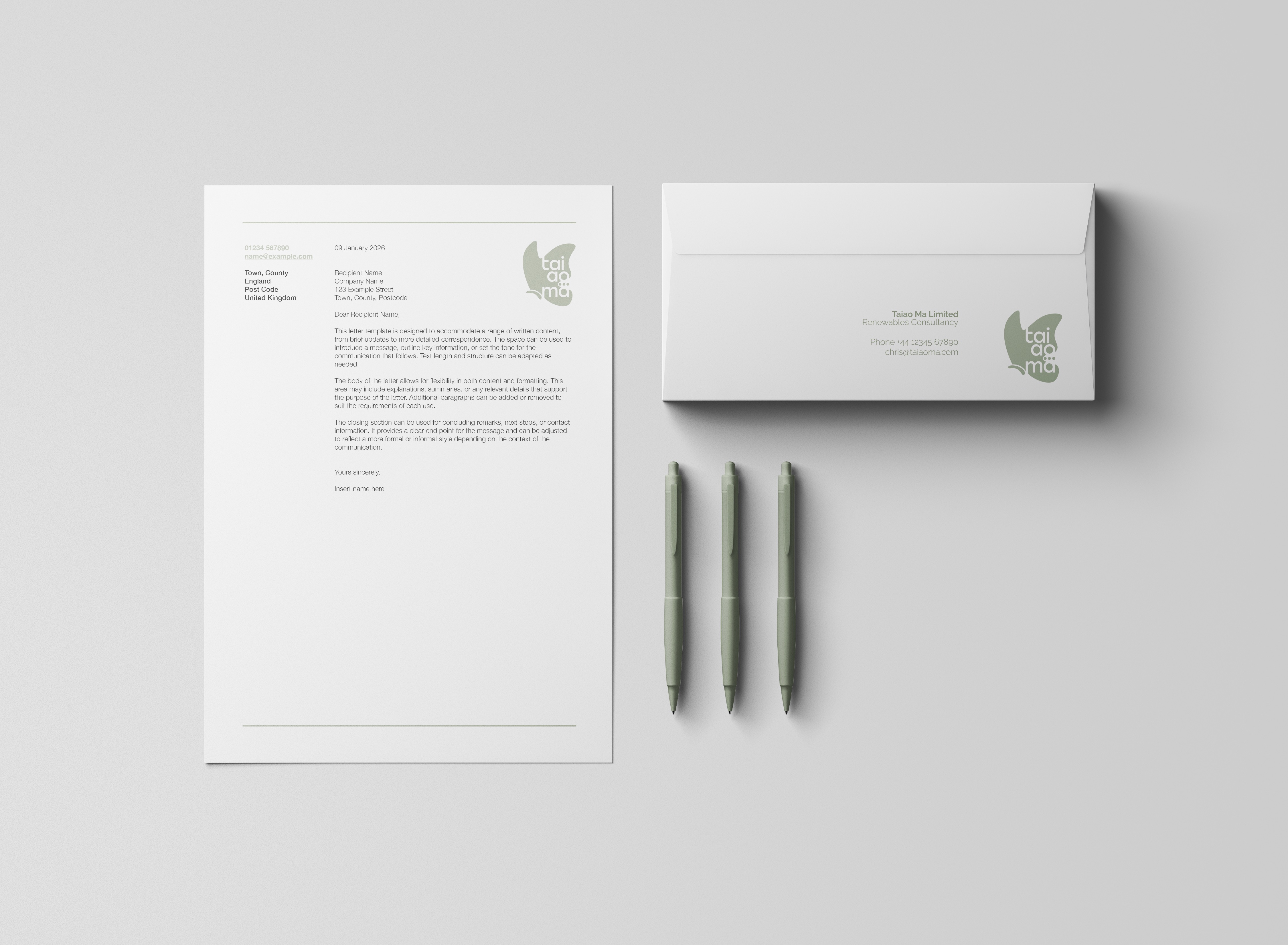
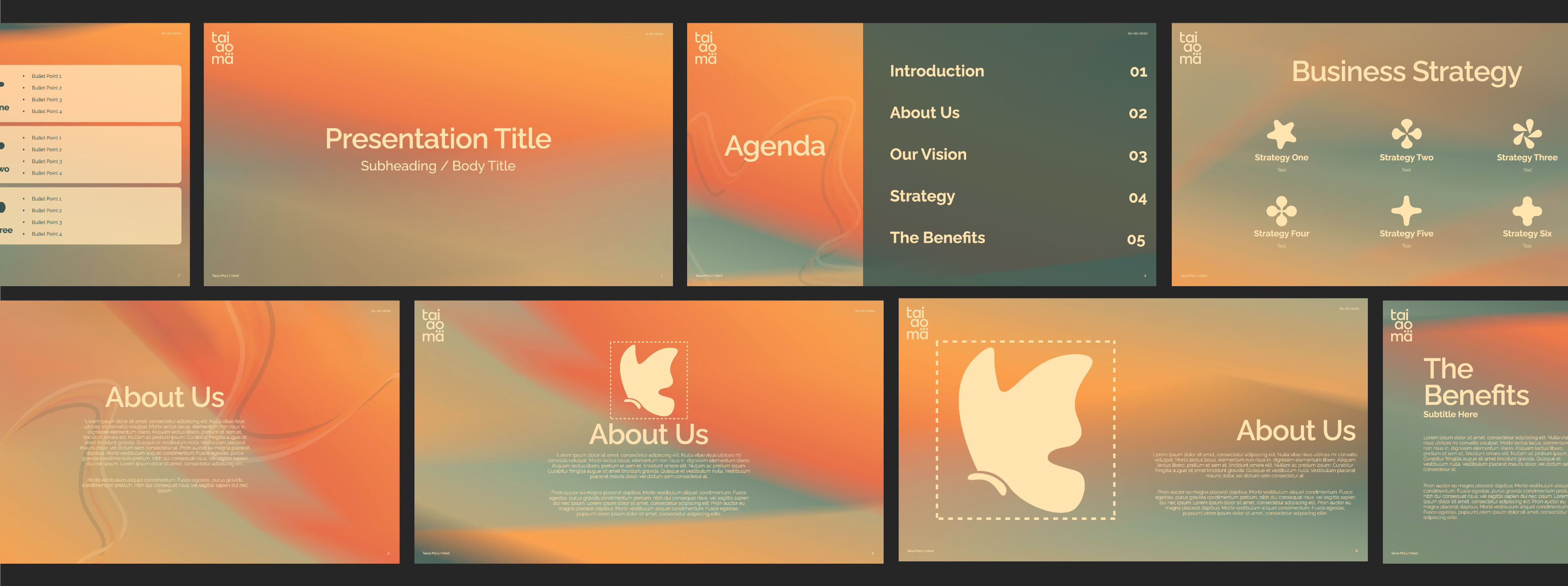
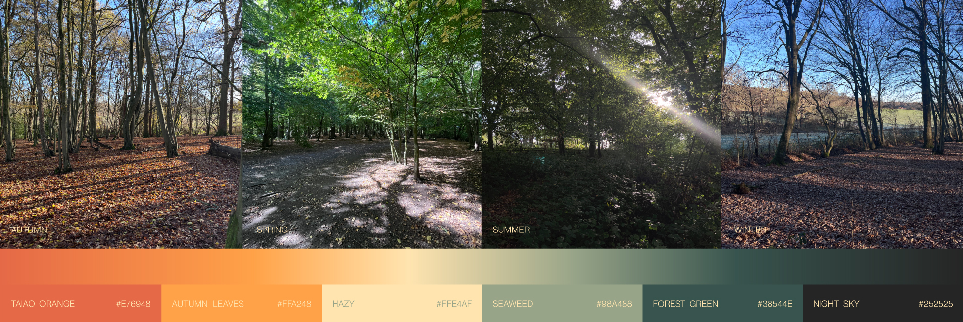
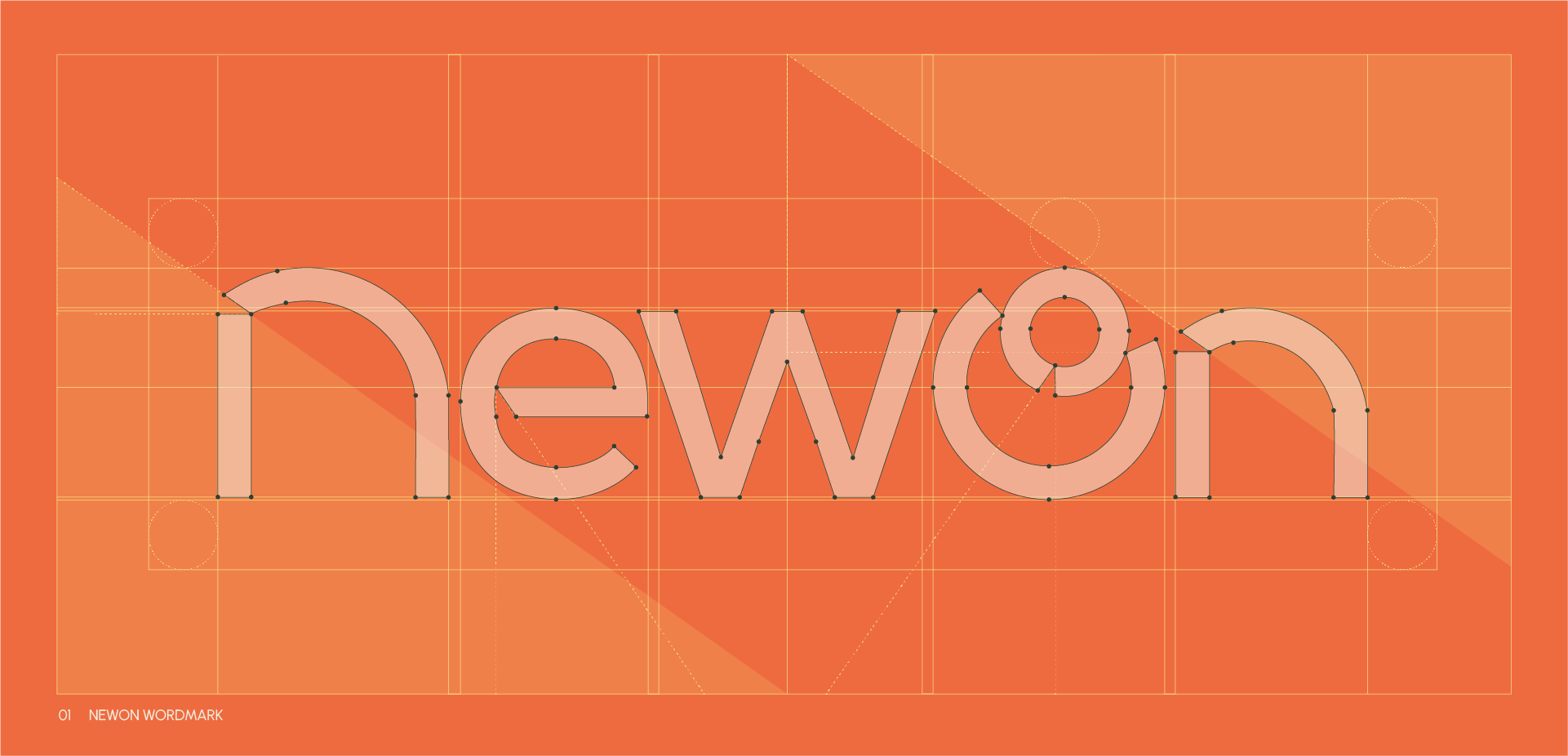
A complete brand toolkit for a renewable energy consultant, our first client.
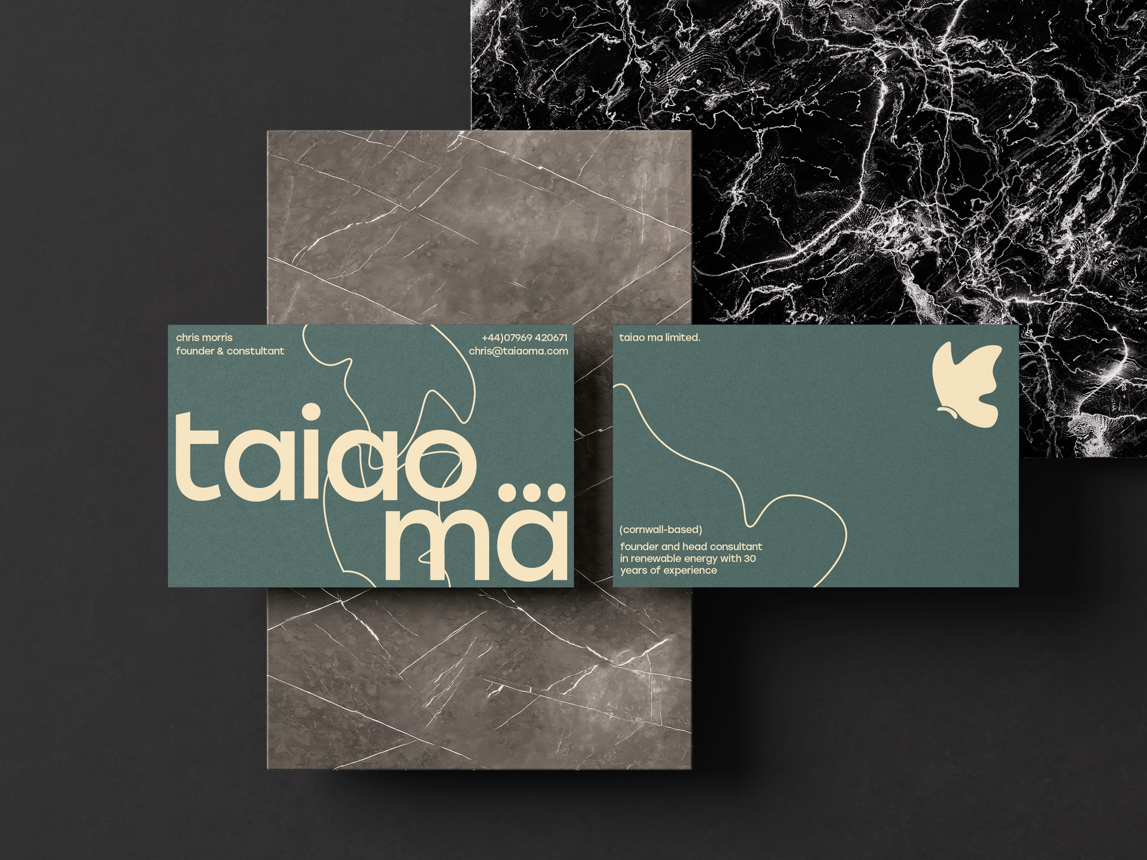
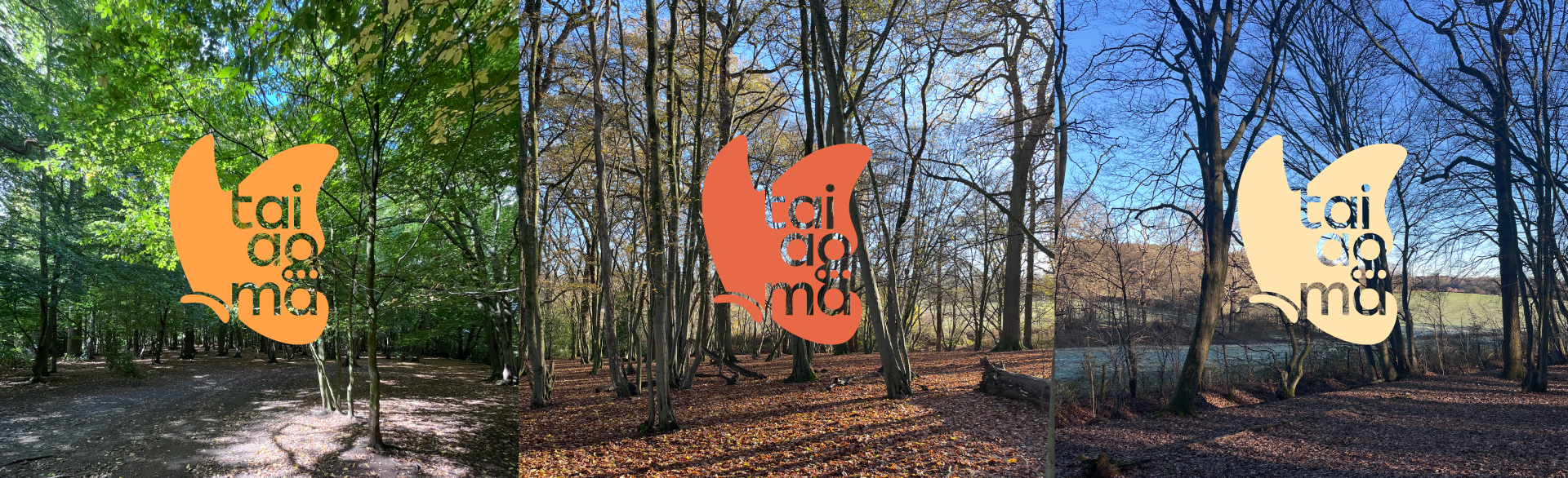
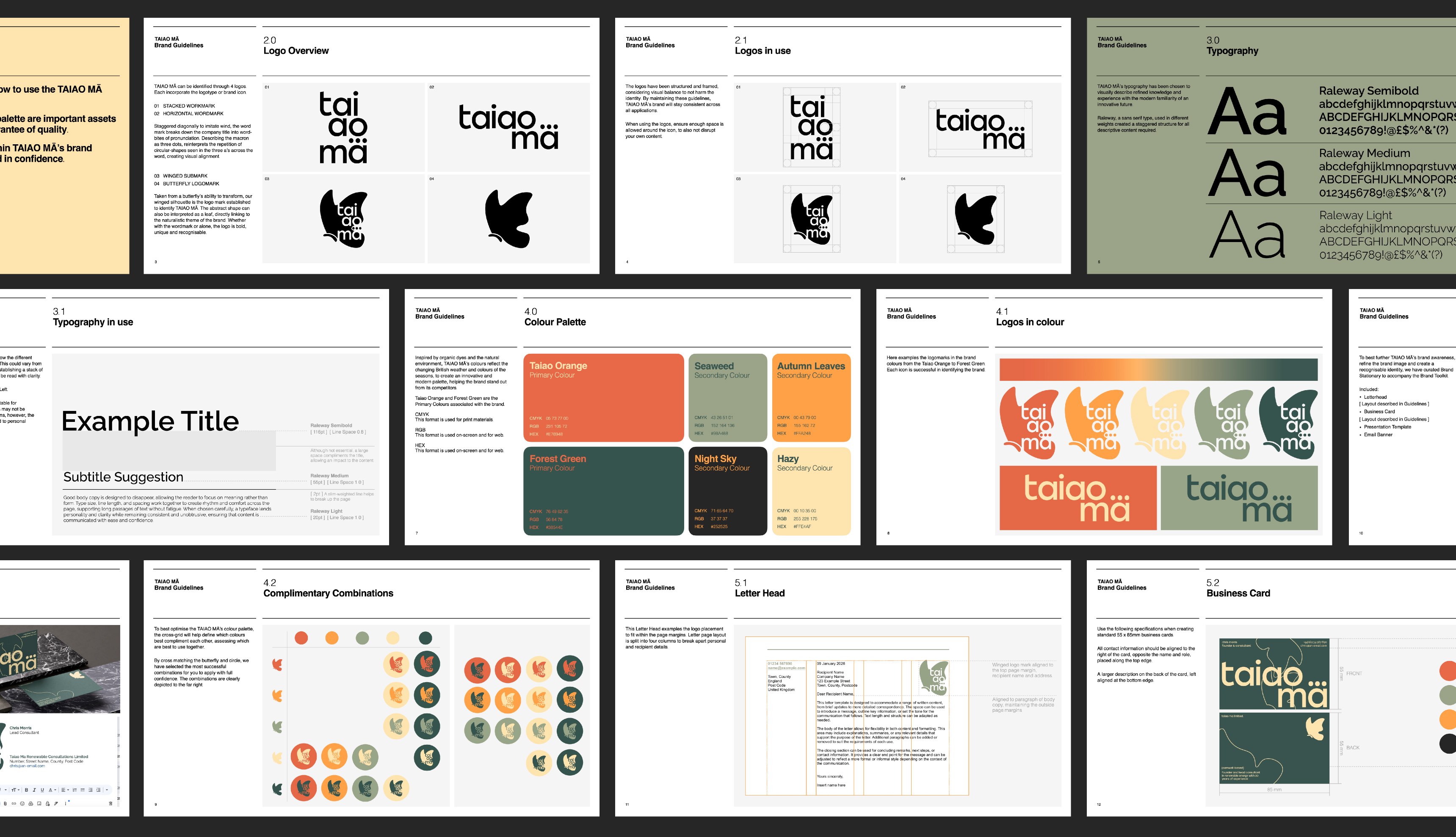
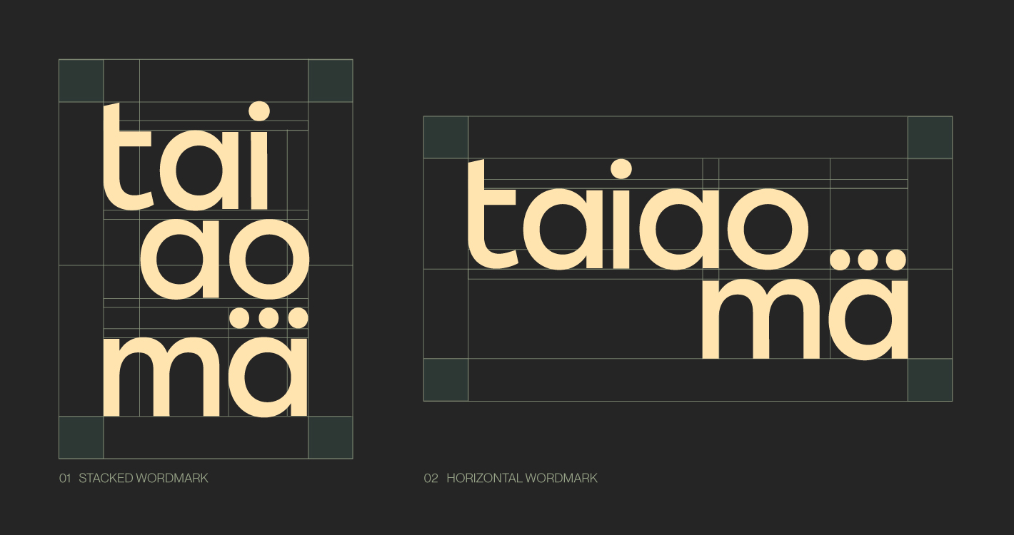
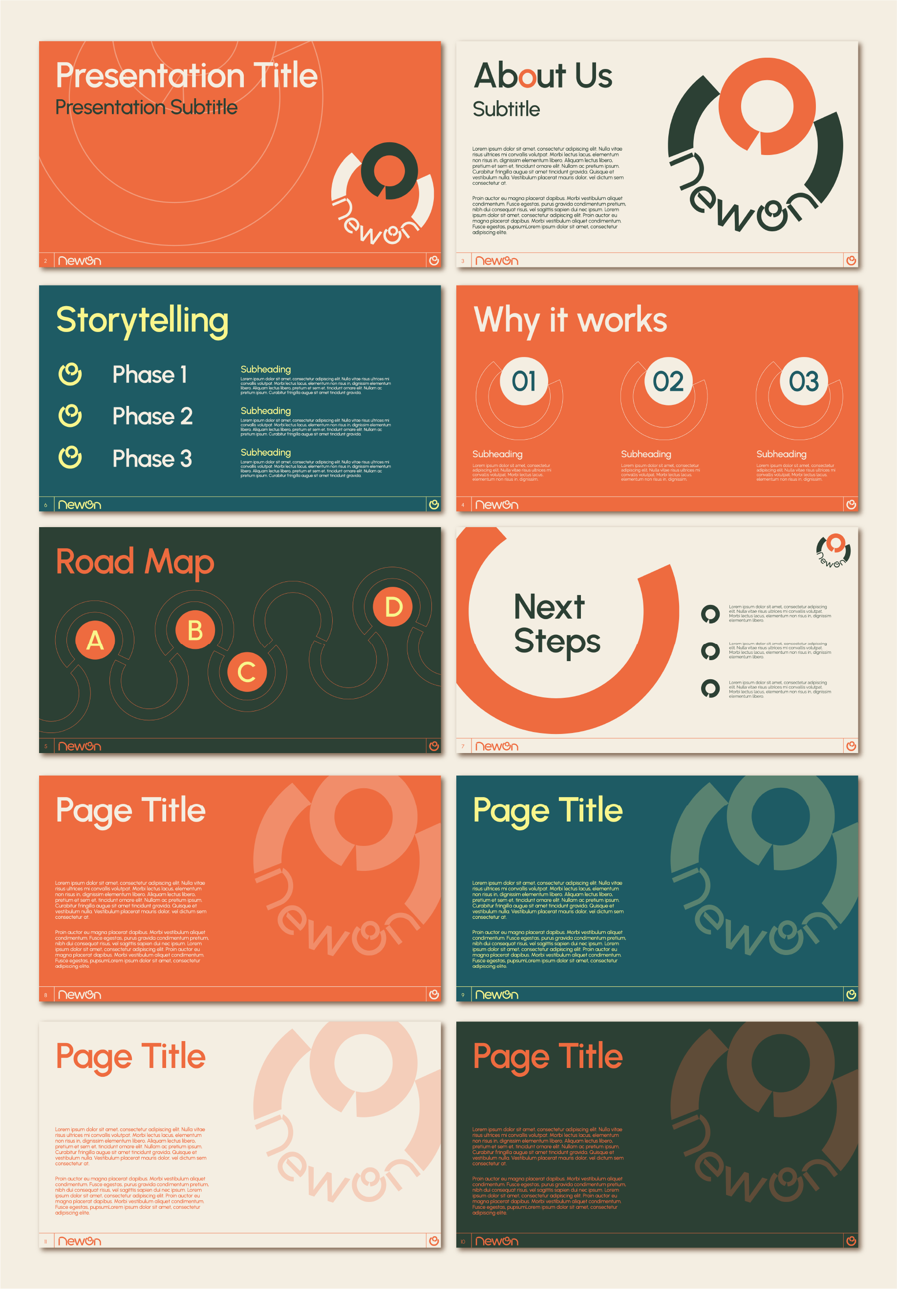
A complete brand toolkit for a renewable energy consultant, guided by authenticity and consistency across print and digital assets. The aim of the project was to create a versatile identity system that would represent the 30 years of knowledge and stay visually relevant to modern standards. To support the unique name of the company ‘Taiao Mā, the stacked word mark is broken into syllables, creating a typographic logo which breaks down pronunciation. The approach supports a structured framework, which allows the client to follow with confidence. With adaptable logos, there is a focus on authenticity which stands out from the company’s competition.